CureSign
Blood Test Mailing Service Kits for Taking One's Own Blood Sample
This website uses cookies. By using the site you are agreeing to our Privacy Policy.

Blood Test Mailing Service Kits for Taking One's Own Blood Sample


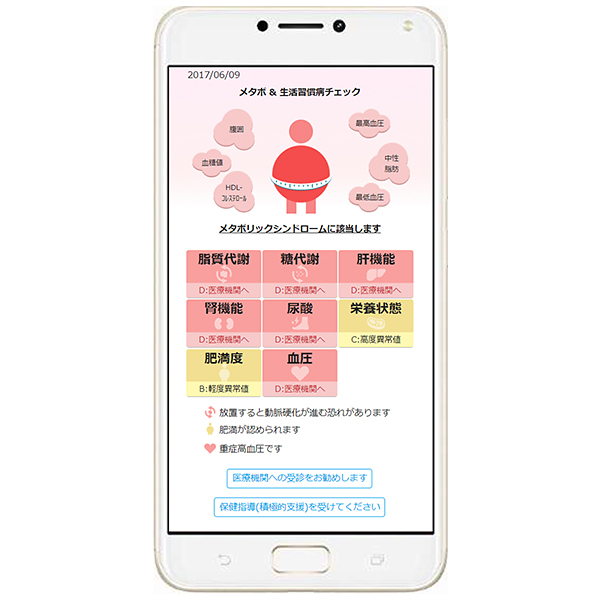
This blood testing service is intended to reveal the risks of lifestyle diseases and cancer. Users themselves collect a small sample of their blood and send it via post to receive test results. We wanted to design the screen in such a way that users could easily understand test results. To this end, we used symbolic pictures to represent physical condition and traffic light colors to indicate level of risk. In addition, we used the most suitable fonts and spacing for reading on smartphones and PCs.
Based on test results, the relevant information is expressed using catchy phrases and pictures. We wanted the design to encourage taking the next step of visiting a hospital when necessary.


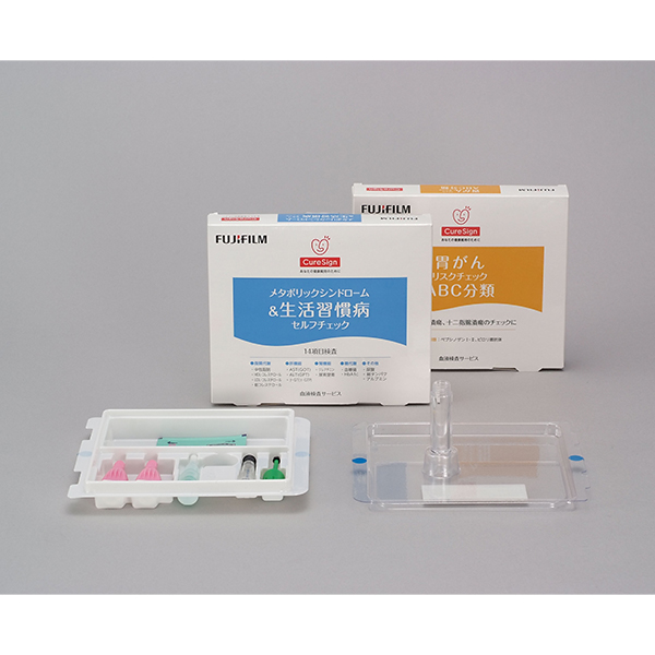
The primary target users for this product are housewives who do not receive regular medical checkups. The packaging is designed to appeal to that user group. In addition, the overall design is intended to reduce any anxiety over taking one’s own blood sample. With a heart-shaped logo design, a clear listing of test categories using friendly colors, and a clinical background based on white, the design is meant to convey that the product provides an easy and simple testing method.


The name was selected to encourage users to maintain their health by having them run tests themselves so they can understand the risk of developing health problems and by reminding them to schedule regular checkups.
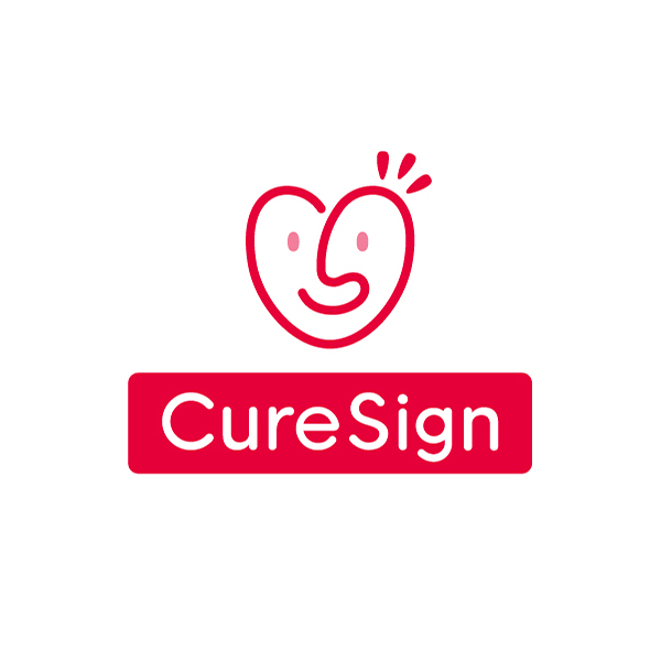
The heart-shaped mark consists of the letters "C" (for "Cure") on the left and "S" (for "Sign") on the right, together depicting a user smiling. A soft, rounded font is used for the logos to convey a sense of security.
