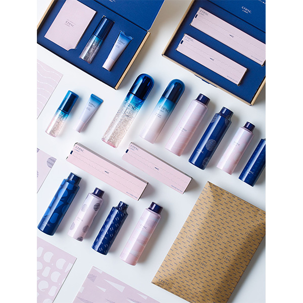
cresc. by ASTALIFT
Cosmetics
Graphic Design
Design that highlights the comfort and pleasure of skin care
The brand name cresc. comes from a musical term, crescendo, and represents our hope that people suffering from dry skin can become more confident about their appearance. A message pops up when opening the crescendo mark-shaped zipper of an individual packaging box. The surface of the container is beautifully decorated with twinkling bubbles. Every time a user receives a refill, they will find a package with a different design pattern. We deliver excitement to users through package design so they can discover something new or surprising the moment they open it.