What can you tell us about the drug identification support system that you worked on?
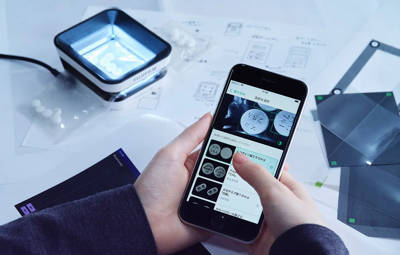
The system uses three elements: an app, a smartphone, and a special imaging stand. When a new inpatient arrives at a hospital, the staff have to record any current medication that they bring with them. With this system, the user places the medication on the stand and photographs it with the phone’s camera. After taking a picture, proprietary AI technology is used to immediately identify the drugs with high accuracy. Pharmacists usually perform this identification by eye alone, and we expect this system to support them in their work.
We heard that there weren’t any similar systems on the market, so you were essentially designing something completely from scratch. What was your mindset like when you were given this task?
I was a little apprehensive when I first heard that there were no existing products to use as references. But when we started development, the lack of similar or competing products meant that external influences couldn’t color my thought process. Being able to design with a blank slate free from preconceived ideas made things easier.
With medical devices and similar products, there is a limit to how much you can refer to your own personal experience when envisaging actual use cases. How did you embark on the initial design?
We started with site visits. However, since we were designing something completely new to the market, we couldn’t see people actually using the system, even on site. So, we started by watching the existing processes that staff use to identify medication by eye.
What did you notice during the site visits?
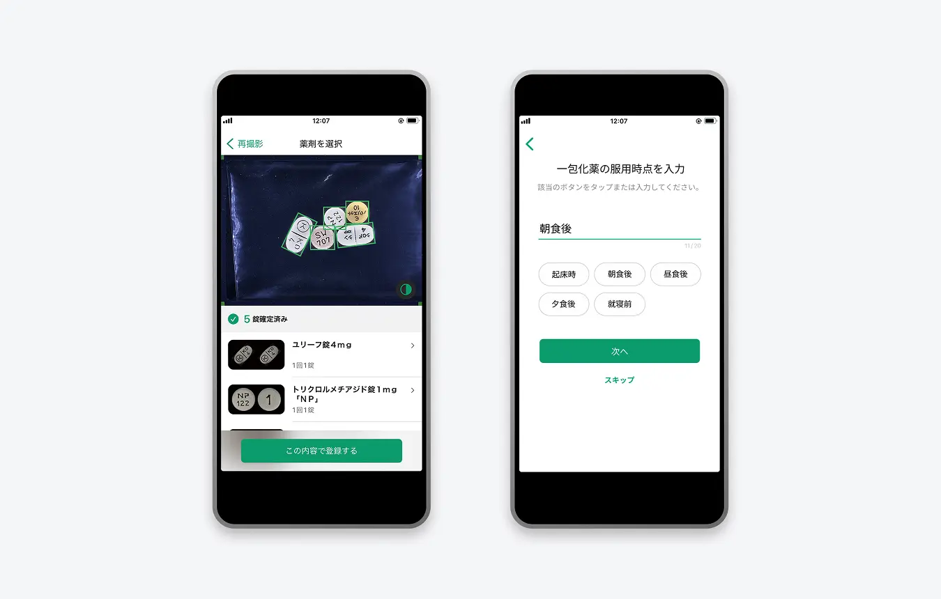
I initially heard that the system would use a smartphone camera to read the engravings on tablets and identify drugs based on that. As a result, I thought that all we needed to do was design the UI for the drug identification screen. In practice, I saw that staff collect an identification request form, then connect that form to a patient’s ID number before the actual drug identification begins. Once medication is identified, the staff still have to add it to the patient’s electronic chart. After seeing the full workflow, I knew that designing an identification screen alone wouldn’t make the process more efficient. We ran the risk of simply adding steps, namely the need to retrieve a smartphone and take a photo, which would actually make things more time consuming. So we started designing with the aim of streamlining the entire workflow, including the steps before and after drug identification itself.
What points did you focus on when finalizing the UI design?
The first thing was making the drugs easy to see. After photographing the medication, users compare the potential matches that the AI gives them, so we looked at image placement to facilitate that comparison. Making the comparison process quicker leads directly to shorter working times, so we explored several layouts and sizes to achieve that. I tested the various options by trying them out myself.
Another key aspect was the screen flow design. I paid a lot of attention to the design of each individual screen, but also put significant effort into considering the overall workflow, including what items should be input first and the order of screen operations. During drug identification, staff also need to input dosage information for each drug. I initially designed the flow to start with inputting that kind of information. However, when I tried using it for myself, I was anxious to do the actual drug identification, but felt like I was taking forever to get to that screen. It was quite irritating. Based on that experience, I changed the design to show the drug identification screen first. A lot of effort went into designing the screen flow so that users feel like they have completed tasks quickly and don’t get frustrated.
What innovations did you incorporate into the UI design of each screen?
We really narrowed down the information shown on one screen. This provides benefits such as enabling users to see at a glance where they need to tap to complete an operation. I think this helps people to feel confident about using the system when they first encounter it.
So you distilled the design down to the minimum required information?
Rather than “minimum,” I would say “necessary and sufficient” is probably closer. As a system used in medical settings, you can’t abbreviate even the longest drug names. Even if a name seems like it will spill over, rather than abbreviating it with an ellipsis, we always use the official name. Conversely, we intentionally don’t show elements that aren’t necessary on a particular screen. This careful curation gives the user the information that is sufficient and necessary for what they need to do.
Just over a year after the product launch, is there anything that makes you glad that you were involved in its design?
In addition to pharmacists, I’m glad to hear nurses saying that they feel confident about using the system when they see it. We initially designed it as a tool to support drug identification by pharmacists, and it can sometimes be difficult to see how highly-specialized tools like this should be utilized, which makes it difficult for hospitals to adopt them. We wanted to avoid that, so I made a conscious effort to create a design that anyone can use. Happily, that approach worked out, and I’m pleased to see that even people not normally involved in drug identification feel like they can use it.
Perhaps that reaction comes from the fact that you implemented simple screen designs and other fundamental principles that make a UI easy for anyone to use.
Frontline medicine faces real staffing shortages, and people’s job roles are shifting. With drug identification, it seems that some medical facilities are trialing workflows in which non-pharmacists perform the initial identification, with pharmacists only doing the final check. Pharmacists only have so many hours in the day, and such workflows can enable them to spend some of that time on other tasks.

If this system is widely adopted, it has the potential to have a big impact on society.
On my site visits to various hospitals, I felt that the work of medical professionals is extremely hectic. Because they have their hands full with the task at hand, they don’t have much time to collect case studies and carry out other research. In addition to reducing working times, I hope that the products we design enable people to dedicate more time to moving medicine forward. Eventually, this comes full circle and benefits us all in the form of even better medical care. I would be delighted if design can make a contribution as part of that cycle.
As a designer, what are you currently curious to pursue?
Through my experience in medical-related design, I have come to realize that having a wider perspective including other areas is essential to making better products and services. Simply improving my ability to design UI isn’t enough. If you don’t become familiar with frontline medical settings and fully understand the intent and background that go along with a product’s introduction, then you can’t put forward ideas to fulfil the expectations of medical professionals. It’s also possible that a design created for one field ends up being relevant in a completely unexpected discipline. In that sense, I try to remain attentive to fields beyond the designs that I am involved in and to retain my curiosity to learn.
- Original text by Masahiro Kamijo
- Photos by Sayuki Inoue
- English translation by Craig Murray