
cresc. by ASTALIFT is a Fujifilm skincare brand for people with sensitive skin. As the design team leader, were you involved from the development stage?
That’s right. I was in my fourth year here when development began. Fujifilm’s ASTALIFT series of functional cosmetics had established itself as an anti-aging skincare* brand, and we built cresc. by ASTALIFT from the ground up based on bringing the benefits of cosmetics made with Fujifilm’s advanced technology to a wider range of age groups through moisturizing skincare intended for people in their 20s and 30s, including those with sensitive skin. It’s also a direct to consumer (D2C) project intended to deliver a unified brand image and worldview to users, so there were a lot of factors to consider before we launched the brand in January 2022.
*Skincare appropriate for skin concerns that change with age
What parts of the design were the most challenging?
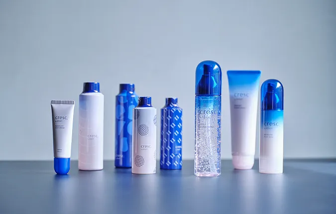
I would say designing users’ “first encounter” with the products and the brand was particularly challenging. We always intended for cresc. by ASTALIFT to be a mail order brand purchased online, although some stores do carry it. The first time that users come into direct contact with the product is when they see the box. Of course, we wanted the conditioner bottle to make an impact, too. But we had to design a total package that also included the individual boxes as a first point of contact in order to fully express the brand’s worldview.
In terms of the concept, we had a target audience of people in their 20s and millennials in their 30s with sensitive skin, and gradually clarified our image of who we were trying to reach even further from there.
I have been affected by eczema since I was young, so skin issues causing stress was a familiar concept to me personally. Your skin can feel great one day, then the seasons shift or something changes in your surroundings, and it worsens suddenly. Even if you want to feel positive, if your skin’s condition is on your mind, it can be very dispiriting. I wanted to create a skincare brand that tackles these fluctuations in skin condition by always being by users’ side, helping them make progress one step at a time, day by day.
Based on this approach, we established the brand philosophy as a presence that accompanies users, promotes enjoyment, and changes together with users. It also inspired the catch copy “through the rough and the smooth, towards skin you love being in.”
We were also coming up with the name at the same time. Everyone was throwing out ideas one after another. In the end, we chose cresc., based on a musical term “crescendo,” meaning “growing gradually stronger.” The name expresses a desire that users’ skin, but also their mental state, keeps improving day after day.
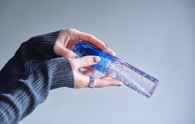
Even the products themselves have a reassuring, charming look. The bubbles in the jelly-like lotion fit well with the bottle’s gradation from deep blue to light pink.
We received samples of the jelly from the lab near the start of development. The team remarked on the beauty of the bubbles, which inspired us to make a bottle that really showcases them. Factories are usually careful to bottle products in a way that avoids air pockets. This time, we intentionally left bubbles floating in the product. They reflect light to create a shimmering effect, exuding a refreshing aura that heightens anticipation of effective moisturizing.
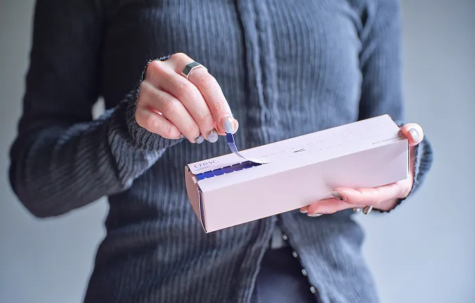
Some people may not even notice, but the tear-off strips on the individual boxes aren’t a straight line. They’re actually in the shape of a crescendo symbol, with the gap between the serrations getting gradually larger as you pull it to the right. After you’ve opened it, the catch copy is revealed. On the strip itself, you can also see one of several messages along the lines of “Have a good time!” That way, even repeat customers have something to enjoy. I hope that people get a kick out of it time after time, kind of like the messages you get on popsicle sticks.
It sounds like your work covered a much broader scope than the typical image of a “designer.”
That might be true. I was communicating with the factory about the manufacturing while also working with the product planners on the brand colors. It was hard work, but seeing everything take shape and putting our products in the hands of so many people brought me joy that I can’t really put into words. I was still only in my fourth year at Fujifilm when we started development. Before I joined, I never would have imagined that I’d be negotiating and coordinating between so many different departments! But at the end of the day, elements such as the concept, the name, the packaging design, and the coloring are closely intertwined. If we were to create a unified brand outlook, then it was somewhat inevitable that I, as the designer, would end up covering such a wide area. I think that’s also something that the product planners expect.
What do you want to achieve in your work?
Most of my work so far, including cresc. by ASTALIFT, has involved receiving a request from the planning department, then working with them to incorporate the required elements. I’d like to go one step further, and become a designer who can “add” things by bringing tasks to the table myself, rather than just completing those given to me.
Every product that reaches users passes through a chain comprising the work of many people, from researchers to designers, advertisers, and sales staff. I hope to become a designer who can have an even bigger impact within that process.

What do you like about working at Fujifilm?
There are two main things. First, we have the freedom to take on new challenges. My managers and senior colleagues take input fully on board, which creates an environment where I can express my ideas and have people listen without much friction. Of course, they let me know if they disagree, but when I’m designing packaging, people are quick to embrace interesting ideas and encourage me to make prototypes. It’s a positive workplace culture in that sense.
The second thing that I like is the breadth of fields that Fujifilm covers. In addition to cosmetics, I’ve designed packaging for instax products and even been involved in medical and industrial equipment projects. I think that Fujifilm is the only manufacturer where I could experience such diverse kinds of work as an in-house designer.
- Original text by Tomoro Ando
- Photos by Sayuki Inoue
- English translation by Craig Murray